Garmin has led the aviation industry for over 25 years now with innovative and pilot-friendly dynamic moving maps in its hardware and software. What started as a basemap for handheld GPS receivers in the 1990s has evolved into a full-featured mapping system used in Garmin’s line of GTN navigators and integrated flight decks found in new production jets. It’s also the same mapping system used in Garmin’s iPad app, providing continuity and familiarity among those flying with both installed and mobile Garmin products.
The latest update improves the design of the moving map by significantly improving readability and expands the graphical NOTAM display on dynamic airport diagrams to include taxiway closures. It also adds support for moving map annotations, decoded NOTAMs and support for Stratux and Bad Elf third-party receivers.
Dynamic Map Enhancements
While Garmin’s map dynamically scales, hides and displays data based on zoom level, it can still come across as cluttered at times, especially when viewing a route that traverses complicated airspace and weather. To improve the readability, Garmin made numerous enhancements to the map, like using thinner lines for airspace boundaries, optimized (a.k.a. smaller) airport icons, and by making non-aviation features like roads and state lines less pronounced. Here’s a comparison of the map before and after the update, at the exact same zoom level:
Taxiway and APRON NOTAMs
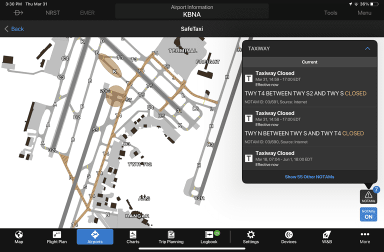
We applaud Garmin’s recent push to overlay important data right on the dynamically-generated SafeTaxi airport diagram. Building on the visual display of runway closures and FICON (rain/snow contamination) information on the diagram, Garmin now shows taxiway and apron closures on the diagrams. When the NOTAM overlay is enabled, the taxiway or apron closed by the NOTAM is depicted with hash lines using the following color classifications:
- Red – area is closed
- Orange – area is closed with conditions that require further investigation, such as a specific location
- Yellow – upcoming closure
You’ll see that orange shading is used most often to highlight partial taxiway closures, but it’s important to recognize that Garmin is coloring the entire length of a taxiway with the orange overlay, even if only a small part of it is closed. For this reason, it’s important to follow up by tapping the NOTAM button at the bottom right of the screen to view the specific closure location of the closure.
Map Annotations
The annotations feature has been extended to the moving map, allowing you to take notes, draw taxiway routings or highlight weather features. To use this feature, first enable the Map Annotations option from the Overlays section of the map menu:
Then activate the drawing tool using the button at the bottom right of the screen, and customize the annotations tool using the menu at the top of the screen:
NOTAM Improvements
In the latest update, NOTAMs are automatically decoded to plain text when possible. This feature can be manually disabled from the main Settings menu if you’d prefer to view the raw data:
There is also now an option to hide graphical 5G NOTAMs, which are only pertinent to those flying larger aircraft with radar altimeters:
New hardware support
Garmin continues to add support for additional third-party receivers in the app. In the last update, they added support for Stratus ADS-B receiver and its full suite of datalink weather and traffic capabilities. This update adds support for the Bad Elf GPS receiver and Stratux ADS-B receiver.
The post Garmin Pilot’s dynamic map gets even better appeared first on iPad Pilot News.
Source: Ipad appsGarmin Pilot’s dynamic map gets even better


