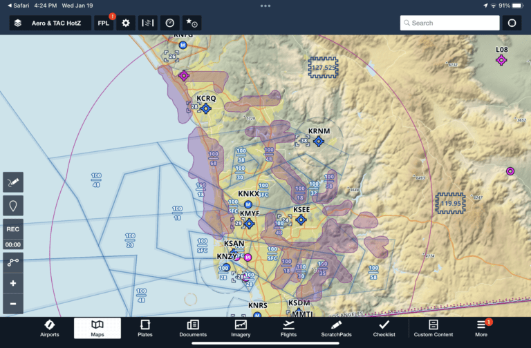
Every once in a while we come across a simple, but clever idea that we think iPad pilots should check out. The latest example is a free add-on for ForeFlight and Garmin Pilot called HotZones. This allows you to add a custom overlay to your app’s interactive map screen showing areas of very high aircraft traffic as determined by historical ADS-B returns. You’ll find this both entertaining and informative, to explore areas around the U.S. and see where airplanes are flying most below 5,000′ AGL.
How to install and use HotZones
HotZones takes advantage of Garmin Pilot and ForeFlight’s ability to import third-party KML/KMZ user overlays (it’ll also work in any other app that supports overlay imports). Here’s how to install the map layers, which takes less than 30 seconds:
Install HotZones in ForeFlight
Install HotZones in Garmin Pilot
Using ForeFlight as an example, you’ll see a new map layer option at the bottom of the list called TAC HotZones:
Zoom in to a region with lots of air traffic and you’ll see magenta shapes on the map showing the “hot zones”, where there has been a historically high volume of air traffic:
The data shown has been filtered, and mostly shows air traffic data below 5,000′ AGL. Traffic inside B, C, and D is also filtered out:
In addition to providing insight when planning a flight in or around unfamiliar airspace, it’s also fun to look around the U.S. and find some sightseeing spots. Here’s a hot zone over the Hoover Dam:
Learn more about HotZones here.
The post HotZones adds traffic density visualizations to your EFB app appeared first on iPad Pilot News.
Source: Ipad appsHotZones adds traffic density visualizations to your EFB app


