 More and more pilots are transitioning from static charts like VFR Sectionals and IFR en route charts to data-driven, dynamic maps in recent years. We have developers like ForeFlight and Garmin to thank, who have created custom aeronautical charts displaying all the relevant VFR and IFR data in a much more user-friendly interface that automatically scales and declutters based on zoom range
These dynamic charts can display much more information than static charts, with options to show only the layers useful for your type of flying for the day. You can then tap on any point, like an airport, airspace or airway, to display a pop-up with additional information. In the most recent update, ForeFlight changed the location of where this pop-up map information appears on the screen.
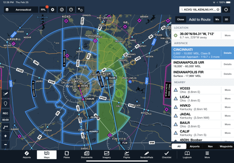
Starting with ForeFlight 13.1, you’ll now see the information for tappable elements in a sidebar on the right side of the screen. Tap and hold on an airport, for example, and you’ll see the same familiar information, except in a new location:
Since the sidebar is no longer “connected” to the spot you tapped, ForeFlight displays a green bullseye on the map to show what you selected:
Select a specific airspace sector from the sidebar and you’ll see it highlighted with green shading:
Airway segments are also highlighted when selected:
The new sidebar appears any time you tap-hold on the map to open the Add to Route window or tap on most Map elements, including Aeronautical Map elements like airports and weather or informational layers like AIR/SIGMETs, TFRs, Fuel Prices, and more. Not all tappable map elements utilize the sidebar, including traffic targets and obstacles.
In addition to keeping the entire map screen viewable and unobscured, the new design allows you to pan around the map while viewing the supplemental information on the right.
Here’s an example from a recent flight, showing PIREP details for a report positioned at the lower left of the screen near KLUK. The new design allows you to read all the details in the sidebar, while still viewing the report location on the map and the full radar imagery surrounding it for additional context.
The sidebar remains open until you tap the Close button or tap on a blank area on the map, allowing you to pan and zoom the map with the sidebar open, tap other map elements to update the sidebar with their information, change map layers or settings, use Map Annotation or the Ruler, and more.
Other New Features
Of course, ForeFlight included a few other additions to check out in the latest update. First, you can now rename PDFs imported into the documents section of the app. Press the Edit button at the top of the screen, and then the “Rename” button that appears next to each document to change the name:
Only documents in the Imported drive support renaming, including documents that you’ve added to binders from the Imported drive. Documents in built-in drives (e.g. ForeFlight, FAA, etc.) and Cloud Document drives cannot be renamed.
Another nice addition is the inclusion of weather reports from airports equipped with SayWeather sensors. The SayWeather system is a more affordable and attainable weather monitoring service for smaller airports, though it is not classified as an official ASOS/AWOS system.
The weather reports for these airports will appear in the METAR section (here’s a map showing current SayWeather installations at airports around the world).
Finally, pilots flying outside of the U.S. will appreciate the reorganized international weather imagery, which has been consolidated by major regions. All European imagery is contained in the Europe region, all South American imagery in the South American region, and Mexican, Caribbean, and Central American imagery is also combined into a single region.
The post ForeFlight adds new Maps sidebar view in version 13.1 appeared first on iPad Pilot News.
Source: Ipad appsForeFlight adds new Maps sidebar view in version 13.1


