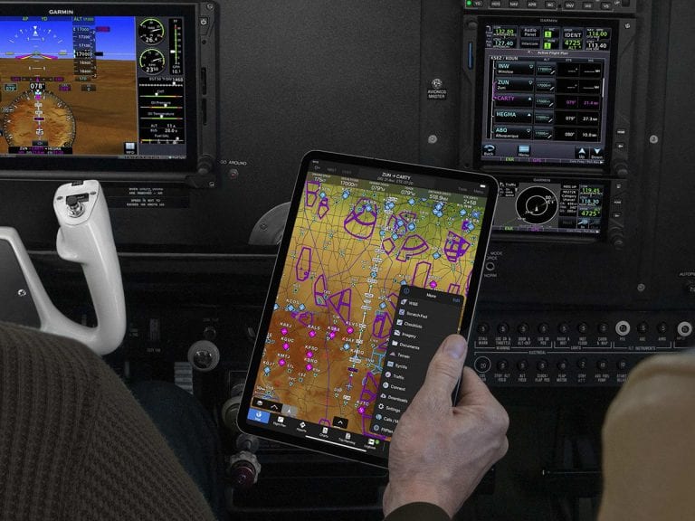
 Garmin has done a great job over the past decade harmonizing the interface of its panel-mount avionics, portable GPS receivers and mobile applications, reducing the learning curve as use you move between devices. For example, the graphical menu in the Garmin Pilot iOS app uses the same icon-driven home screen as the panel-mount Garmin GTN 750 and Garmin Aera 760 portable navigator.
While many pilots appreciate this consistent interface between Garmin products, the graphical menu on iOS requires extra taps to switch between screens compared to other EFB apps and doesn’t follow the typical iOS app interface conventions. To improve the app’s usability in the cockpit, Garmin now offers an alternate interface option in the app which many iPad pilots will welcome – a tab bar at the bottom of the screen.
The best news about this update is that Garmin isn’t forcing the tab bar on you; rather you have the choice to switch between the tab bar interface and the traditional home screen menu. After updating to version 10.2, you’ll see a pop-up alert to select your preference when launching the app:
This can be switched at any time – just go to the main settings screen and select the other display option in the appearance group:
The tab bar will permanently display 6 functions of your choosing moving from left to right. The functions used most recently will display to the right side of the separator line on the tab bar, and the More button provides access to the remaining functions.
Tap the Edit button at the top of the list to set the desired order and select which functions you’d like permanently shown on the left side of the tab bar.
What else is new
Earlier this year Garmin added the ability for the app to analyze your flight plan and download charts and aviation data as needed for the proposed route with one tap. The latest update extends this functionality to the Trip Planning section of the app, using the familiar suitcase icon next to the File button. After entering your flight, push this Route Data button to review and download the required data for the trip.
The other new feature added in this update is a Live Track Log, or breadcrumb trail, on the moving map. This appears as a checkered line on the map to show the track of your current flight and will remain displayed for up to 60 minutes after the flight or until you close the app.
To enable this feature, first go to Logbook > Settings and enable the Flight Track Logging setting.
Then, go to the Map screen and select the Layers button at the bottom left, and tap Live Track Log from the Overlays menu.
So far these feature additions are for iOS devices. Garmin often follows with Android updates a few months after the iOS version, but nothing has been announced yet. A Garmin Pilot subscription starts at $74.99.
The post Garmin Pilot adds tab bar interface and new features appeared first on iPad Pilot News.
Source: Ipad appsGarmin Pilot adds tab bar interface and new features


